Pink tiles have quietly moved from niche to necessity in modern interiors. What was once seen as playful or purely decorative is now recognised as sophisticated, calming, and surprisingly versatile. Designers, developers, and homeowners alike are rediscovering pink not as a trend, but as a design tool, one that brings warmth, softness, and character into spaces that often feel cold or overly minimal.
At Luxury Tiles UK, pink tiles have become one of the most explored colour collections, not because they shout for attention, but because they whisper confidence. From soft blush marble to muted rose porcelain and pink mosaics, the collection reflects how pink has matured in interior design.
This guide is written for interior designers, builders, homeowners, renovators, and property developers who want to understand how to use pink tiles properly, not just where to place them, but how to make them work long-term, commercially and aesthetically.
Why Pink Works So Well in Modern Interiors
Pink works because it behaves differently from most colours. While greys cool a space and whites neutralise it, pink gently warms it without overwhelming the eye. It sits somewhere between a neutral and a colour, which is why it pairs effortlessly with stone, wood, brass, black, and even concrete.
Think of pink tiles like good lighting. You may not always notice them immediately, but you feel better in the space because of them.
Psychologically, pink is associated with calm, reassurance, and softness. In interiors, this translates to spaces that feel welcoming and human rather than clinical or harsh. This is especially important in bathrooms, kitchens, and living spaces where people want comfort as much as beauty.
From a practical perspective, pink tiles:
-
Reflect light gently rather than sharply, these undertones absorb part of the light spectrum before reflecting it. The result is a muted glow rather than a stark shine.
-
Hide water marks better than pure white, even the faintest mark breaks the visual surface. That’s why white bathrooms often look dirty quickly, even when they are perfectly clean.
-
Age more gracefully than bold colours, because their soft, muted tones don’t overwhelm the eye or lock a space into a specific trend or era. As light, wear, and interiors evolve over time, pink adapts quietly, masking minor imperfections and remaining visually calm rather than becoming dated or tiring.
-
Work across residential and commercial projects, their soft warmth feels welcoming in homes while still appearing refined and professional in public environments. Unlike bold colours that can feel too personal or too dramatic, pink creates a balanced, calming backdrop that suits everyday living as well as high-traffic, design-led commercial interiors.
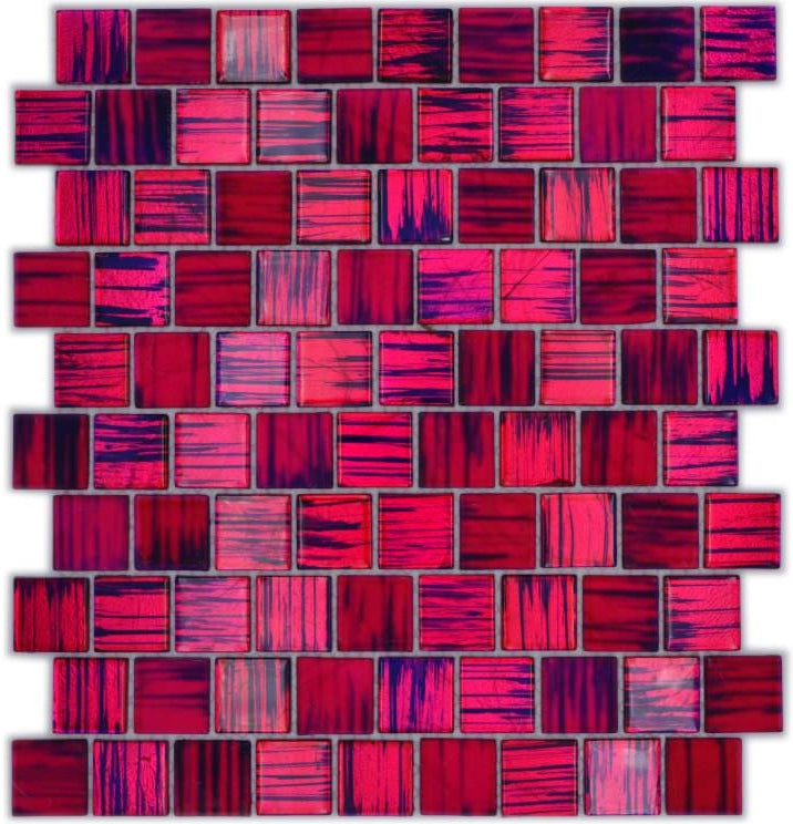
The classic Nemesis Pink Gloss Mosaic Tile in 4 mm and 8 mm is a stunner when it comes to Interior designs. Once used by a customer for a new Shop, it has been an ongoing bestseller, especially in commercial places., ever since.
This pink gloss mosaic tile adds instant depth and movement through its rich mix of tones and reflective finish, making walls feel vibrant without overwhelming the space. The small mosaic format works beautifully in splashbacks, showers, niches, and feature areas, while also hiding water marks and everyday wear better than flat tiles. It’s a confident yet practical choice for anyone who wants a statement surface that feels luxurious, durable, and visually timeless.
The Evolution of Pink Tiles: From Trend to Timeless
Pink tiles are not new. They appeared heavily in the 1950s, particularly in bathrooms. What changed is how they are used.
Old pink interiors relied on strong bubblegum tones and heavy matching suites, as can be seen with our Nemesis Pink Gloss Mosaic Tile. Today’s pink tiles are softer, stone-inspired, and often paired with natural textures. The result feels modern, grounded, and elegant.
Modern pink tiles lean toward:
-
Blush:
Blush is such a strong choice because it sits perfectly between colour and neutral, adding warmth without dominating a space. It flatters natural and artificial light, softens hard surfaces like tile and stone, and makes rooms feel calmer and more inviting. Unlike stronger pinks, blush blends effortlessly with wood, stone, brass, black, and white, which is why it works so well across both modern and timeless interiors.
-
Dusty rose:
Dusty rose is a strong choice for interior designers because it delivers colour with restraint, allowing spaces to feel expressive without becoming overpowering. Its muted, greyed undertones make it easy to layer with stone, wood, metals, and neutrals, giving designers flexibility across different styles and lighting conditions. Most importantly, dusty rose ages well, photographs beautifully, and adds warmth and depth while still feeling refined and professionally considered.
-
Pale clay:
Pale clay is ideal for minimalist interiors because it introduces warmth while remaining grounded and understated. Its earthy undertones connect naturally with stone, plaster, concrete, and wood, reinforcing a calm, material-led design language. Rather than acting as a colour feature, pale clay behaves like a soft neutral, supporting clean lines and open space. It diffuses light gently, helping minimalist rooms feel balanced instead of stark. This makes pale clay perfect for interiors that aim to feel simple, timeless, and quietly human.
-
Soft peach-pink:
Soft peach-pink brings warmth and light to an interior without feeling decorative or overly feminine. Its subtle blend of pink and warm beige undertones makes spaces feel brighter, calmer, and more welcoming, especially in rooms with limited natural light. The colour pairs effortlessly with natural materials like wood, stone, and brushed metals, keeping the overall design balanced and refined. Because it sits close to neutral, soft peach-pink adds personality while still feeling timeless and easy to live with.
-
Natural pink marble tones:
Natural pink marble tones are valued because they combine colour with the authenticity and depth of real stone. Unlike flat, manufactured shades, pink marble contains soft veining, mineral variation, and layered undertones that give surfaces movement and visual richness. These natural inconsistencies help the colour feel organic rather than decorative, allowing it to function almost like a neutral in refined interiors. As the stone ages and develops a gentle patina, the pink tones gain character rather than looking dated, which is why designers often use them in spaces intended to feel timeless and luxurious.
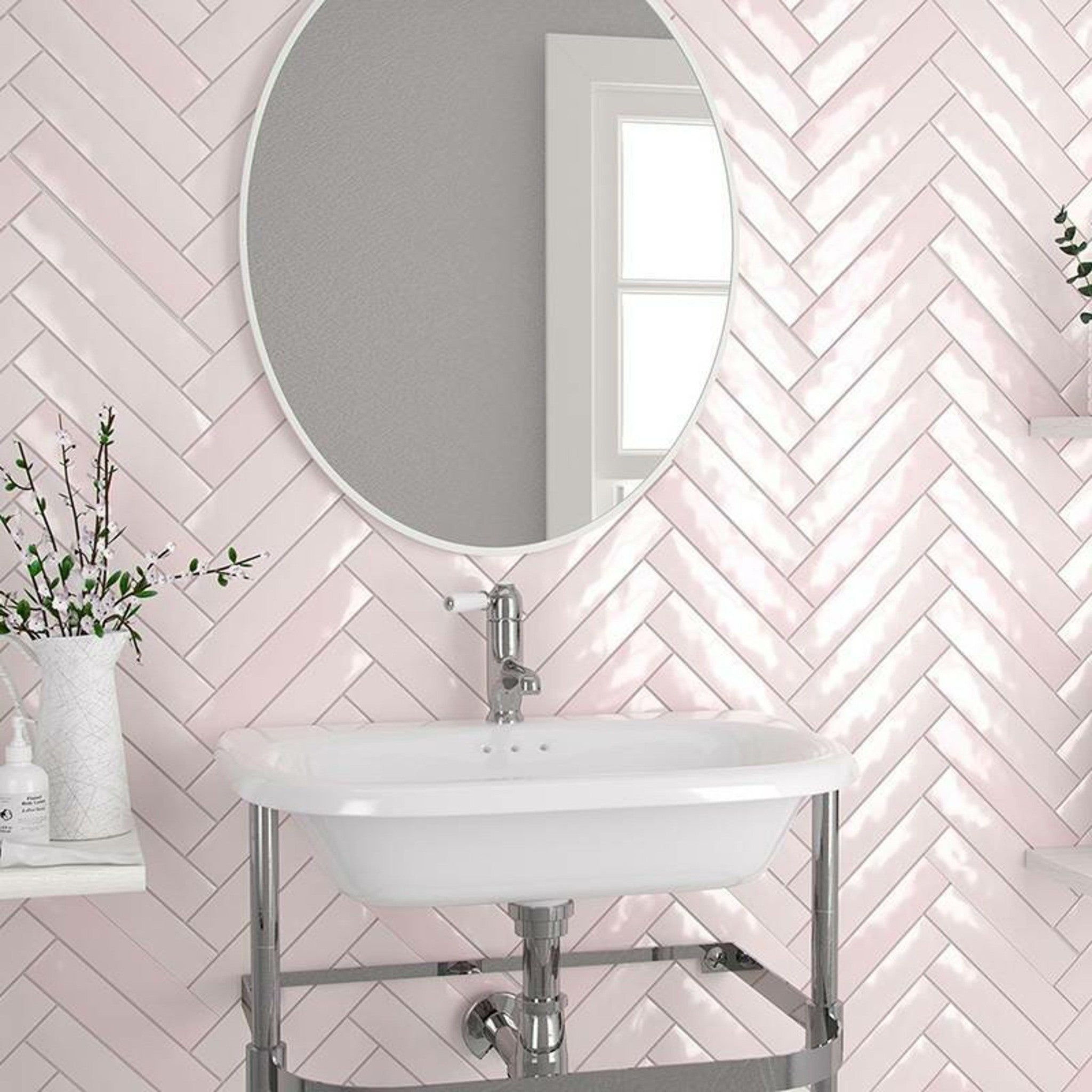
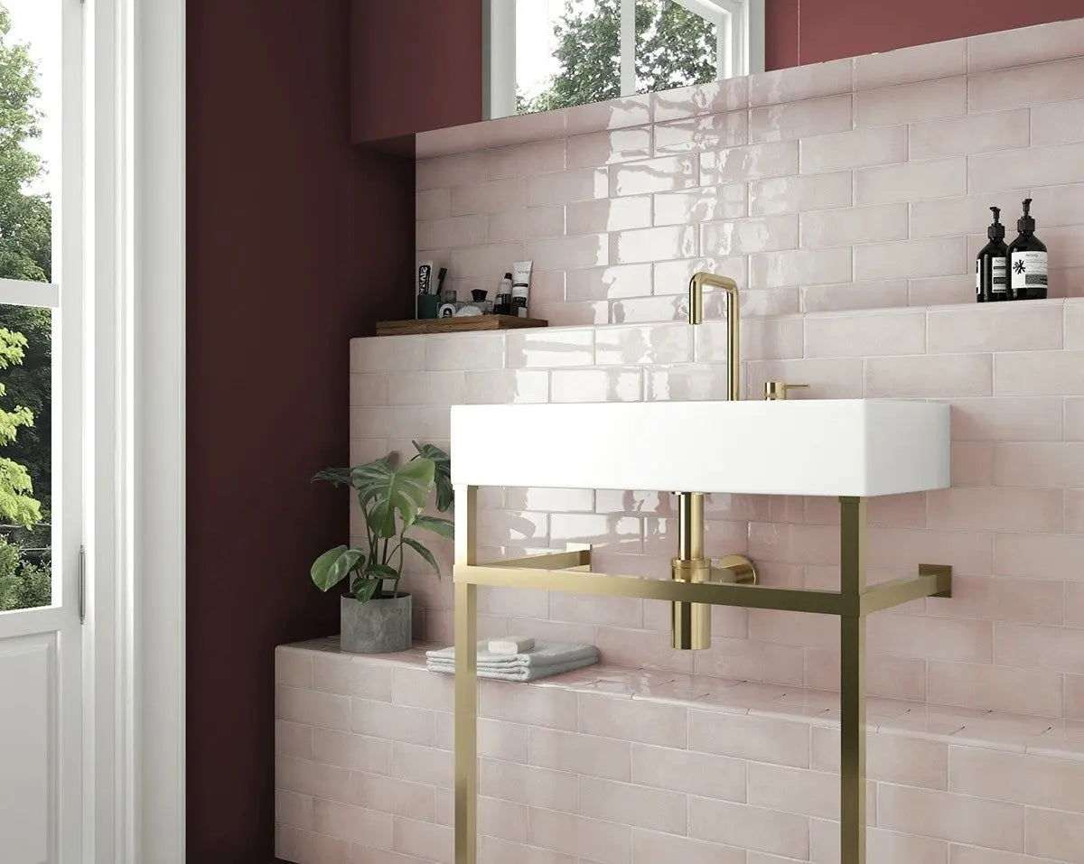
A great example of this scheme is our Blush Pink Herringbone Flat Metro Wall Tile, as it has a Pink Pastelle colour.
Unlike flat tiles, the subtle pattern creates light and shadow, which brings movement to walls throughout the day and prevents the pink from feeling flat or overly sweet. This makes it ideal for feature walls in bathrooms, shower areas, or statement panels where you want impact without visual overload.
From a design perspective, blush pink acts as a refined neutral, pairing effortlessly with stone, wood, brass, black fittings, and soft whites. It adds character while remaining calm, which is why it works equally well in contemporary homes, boutique-style interiors, and high-end residential developments.
Types of Pink Tiles and How to Use Them
Pink Marble Tiles: Quiet Luxury with Depth
Pink marble tiles bring a sense of depth that manufactured colours ca not replicate. Natural veining adds movement and interest, making walls and floors feel alive rather than flat.
Pink marble works exceptionally well in:
-
Luxury bathrooms
-
Boutique hotel interiors
-
Feature walls in living spaces
-
Spa and wellness environments
For designers, pink marble is a gift. It already contains variation, so you do not need to over-style the room. Pair it with brushed brass, warm oak, or soft limestone for a balanced look.
Pink Porcelain Tiles: Practical and Versatile
Porcelain pink tiles offer the visual softness of pink with the durability required for high-traffic spaces. They are ideal for:
-
Porcelain tiles are ideal for kitchens because they are extremely durable and designed to handle daily wear, heat, and heavy foot traffic without deteriorating. Their low porosity means they resist stains, spills, and moisture, which is essential in cooking and washing areas. Porcelain is also easy to clean, making it practical for splashbacks and floors where grease and food marks are common. In design terms, porcelain tiles can replicate stone, marble, or concrete while offering consistent colour and finish. This combination of performance and aesthetics makes porcelain tiles a reliable, long-term choice for kitchen interiors.
-
Commercial bathrooms:
Pink porcelain tiles are well suited to commercial bathrooms because they combine high durability with a softer, more welcoming aesthetic than stark white or dark colours. The porcelain body is dense and low-porosity, making it resistant to water, stains, chemicals, and heavy daily use. Pink tones help mask water marks, limescale, and minor wear, keeping washrooms looking cleaner for longer between maintenance cycles. Visually, pink creates a calm and hygienic atmosphere without feeling cold or clinical, which improves user experience in public spaces. This balance of practicality, cleanliness, and refined design makes pink porcelain tiles a smart choice for commercial bathroom environments.
-
Hallways:
Pink porcelain tiles work especially well in hallways because they are tough enough to handle constant foot traffic while still making the space feel warm and inviting. Porcelain resists scuffs, dirt, and moisture brought in from outdoors, which helps high-use entrance areas stay presentable over time. The soft pink tone brightens hallways without the starkness of white, reducing the appearance of dust and wear. Visually, pink adds character to what is often a transitional space, helping it feel intentional rather than forgotten. This makes pink porcelain tiles a practical and design-led choice for both residential and commercial hallways.
-
Open-plan living areas:
Pink porcelain tiles are an excellent choice for open-plan living areas because they help create warmth and cohesion across large, connected spaces. Their durability makes them suitable for zones with mixed use, from kitchens and dining areas to walkways and seating spaces. The soft pink tone adds subtle character without visually dividing the room, allowing the space to flow naturally. Porcelain’s consistent finish keeps the floor looking calm and unified rather than busy. This makes pink porcelain tiles ideal for open-plan layouts that need to feel connected, practical, and welcoming.
Porcelain tiles in pink tones often mimic stone or concrete, making them ideal for projects that need consistency and performance. Builders appreciate them for their ease of installation and low maintenance, while homeowners love how forgiving they are in daily life.
Pink porcelain tiles also work beautifully with underfloor heating, making them practical as well as stylish.
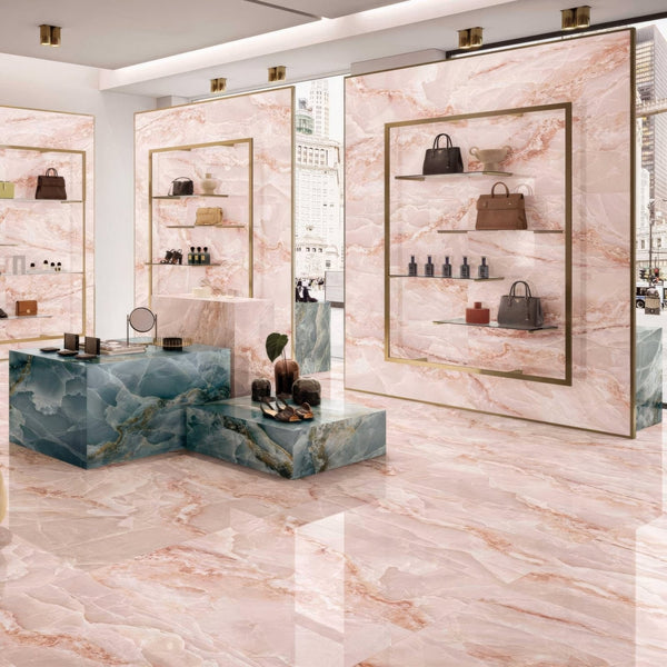
A great is example is shown by our Onyx Pink Matt Floor and Wall Porcelain Tile
This pink onyx–effect porcelain tile is a strong choice because it creates instant visual impact through its layered pattern and soft, luminous tones. For interior designers, it works as a statement surface that adds depth and luxury without needing excessive decoration. Shop owners benefit from the way the tile enhances product displays, creating a refined backdrop that draws attention without overpowering merchandise. The gentle pink tones reflect light softly, helping retail and commercial spaces feel brighter and more inviting. Its porcelain construction makes it durable, low-maintenance, and suitable for high-traffic environments. This balance of elegance and performance makes it perfect for residential, retail, hospitality, and showroom interiors.
Pink Mosaic Tiles: Detail That Transforms a Space
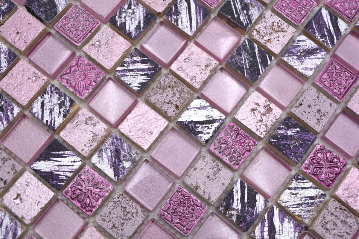
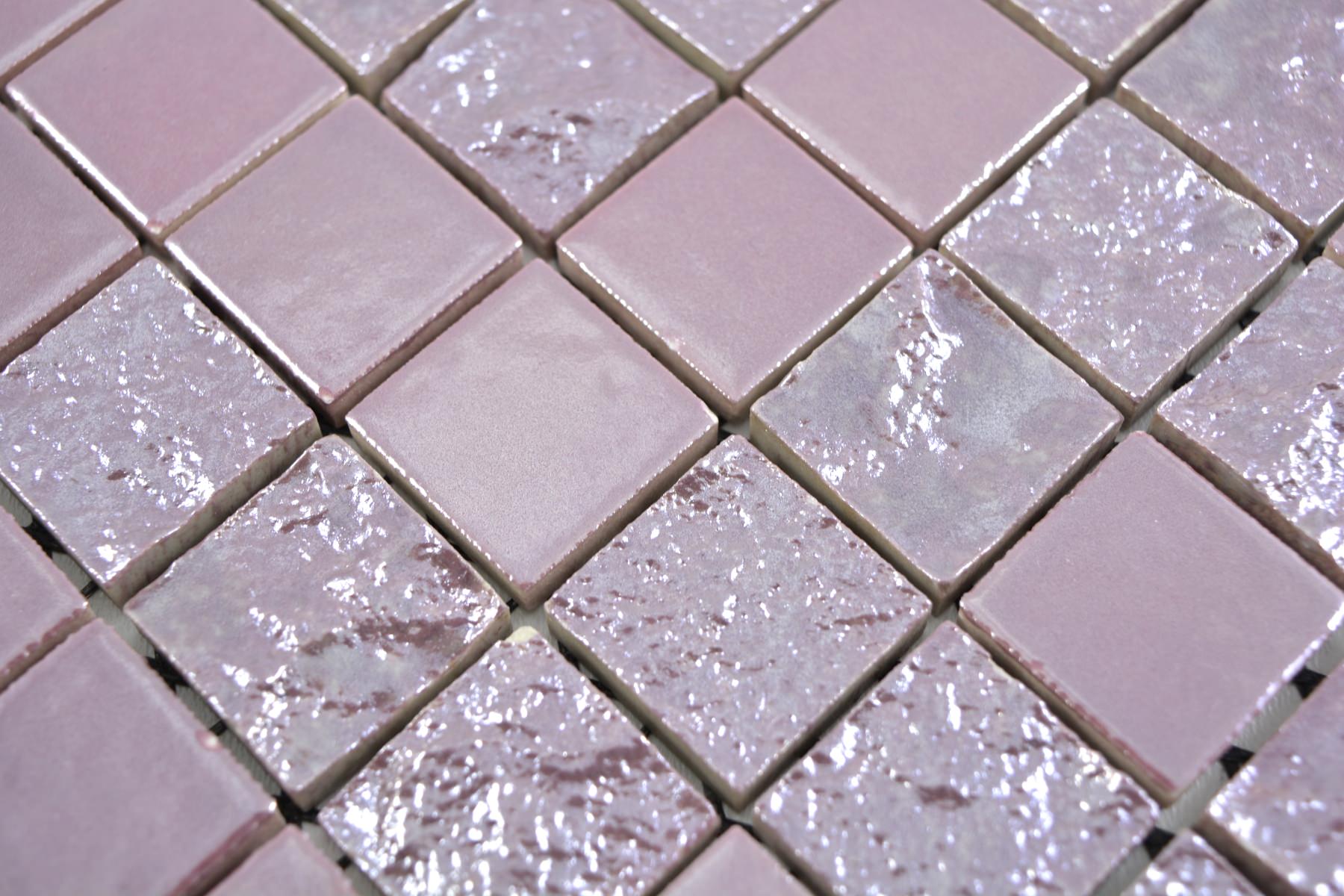
Pink mosaic tiles are about detail and texture. They catch light differently throughout the day, adding movement to areas that might otherwise feel static. The above Mosaic shows our Pink Aura Mosaic Tile - Artisan Mix of Glas, Stone & Resin, which is a strong choice because it creates instant visual impact through its layered pattern and soft, luminous tones. For interior designers, it works as a statement surface that adds depth and luxury without needing excessive decoration. Shop owners benefit from the way the tile enhances product displays, creating a refined backdrop that draws attention without overpowering merchandise. The pink tones reflect light softly, helping retail and commercial spaces feel brighter and more inviting. It is porcelain construction makes it durable, low-maintenance, and suitable for high-traffic environments. This balance of elegance and performance makes it ideal for residential, retail, hospitality, and showroom interiors.
They work particularly well in:
-
Kitchen mosaics are perfect for splashbacks because their small format adapts easily around sockets, corners, and awkward spaces without awkward cuts. The multiple grout lines help disguise splashes, water marks, and everyday cooking residue, keeping the area looking cleaner for longer. Mosaics also reflect light in a broken, textured way, which brightens the kitchen without creating glare. Design-wise, they add depth and detail to what is often a narrow surface, turning a practical zone into a feature. This makes mosaic splashbacks both highly functional and visually impactful in everyday kitchens. A great example can also seen below with our Hex Lilac Mosaic Sheet.

-
Shower walls:
Pink mosaics are a great choice for shower walls because their small tile format works seamlessly with constant water exposure and uneven surfaces, allowing for better drainage and a more secure installation. The multiple grout lines provide extra grip and help reduce the visibility of water marks, limescale, and soap residue. Pink tones soften the look of wet areas, creating a calm, spa-like atmosphere rather than a cold or clinical feel. Mosaics also reflect light in subtle variations, adding depth and movement to shower walls. This combination of practicality, safety, and warmth makes pink mosaics ideal for both residential and commercial showers.
We also have a suitable Pink Mosaic for your Shower Floors, it is an Anti-Slip Mosaic with R10 Resistance, ourBubblegum Pink Anti-Slip Hexagon Mosaic 26x30cm
Its anti-slip surface makes it especially suitable for showers, wet rooms, and walk-in enclosures where traction is essential without compromising on appearance. Remember, a tile doesn’t have to feel rough to be safe, this mosaic achieves grip through format and finish rather than harsh texture, keeping it comfortable under bare feet.
-
Vanity surrounds a great place for mosaic tiles because the small format wraps neatly around sinks, curves, and edges without awkward cuts. In areas exposed to splashes and frequent use, mosaics help disguise water marks, toothpaste residue, and minor wear, keeping the vanity area looking clean for longer. Pink tones soften the space, making the vanity feel warmer and more inviting rather than purely functional. The texture and pattern also add visual interest at eye level, turning a practical zone into a design feature. This makes pink mosaics a smart and elegant choice for framing bathroom vanities.
For designers, mosaics allow you to introduce pink without committing to large surfaces. For homeowners, they are a safe way to experiment with colour in a controlled, elegant way.
Using Pink Tiles Room by Room
Pink Tiles in Bathrooms: Calm, Clean, and Contemporary
Bathrooms are where pink tiles truly shine. The softness of pink balances the hard surfaces typical of bathrooms, making the space feel warmer and more relaxing.
Instead of stark white walls, pink tiles create a spa-like environment that still feels clean and hygienic. Blush or pale rose tiles paired with stone-effect floors work particularly well. Create a Trend setting bathroom and let guests be stunned by the luxurious feel and clean design of our Blush Gold Metro Wall Tile.
Practical tip:
Use matte pink tiles on walls to reduce glare and polished finishes sparingly for contrast.
Pink Tiles in Kitchens: Warmth Without Overpowering
Kitchens benefit from pink because it softens what is often a very functional space. Pink splashbacks work beautifully with:
-
White cabinetry
-
Natural wood units
-
Grey or stone worktops
Pink tiles also reflect light softly, making kitchens feel brighter without looking clinical.
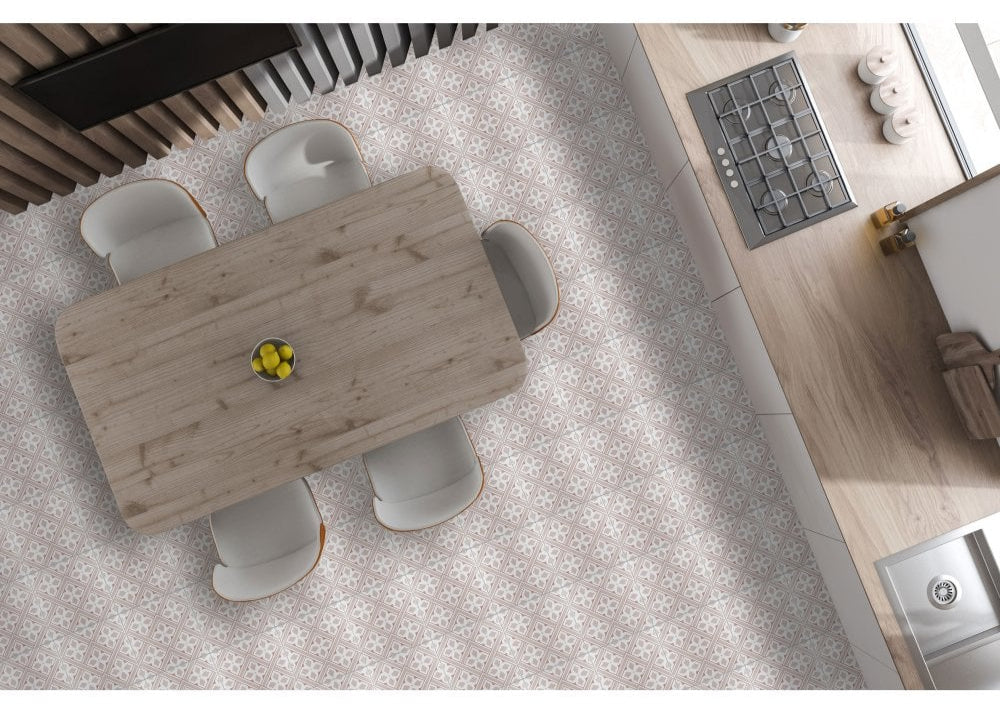
It is an excellent choice for a kitchen floor because it balances practicality with visual character in a way few materials can. The Mr Jones Pink patterned Porcelain Tile design helps disguise everyday crumbs, splashes, and minor marks, keeping the kitchen looking tidy between cleans, something especially important in busy households.
Being porcelain, the tile is highly durable, stain-resistant, and non-porous, making it well suited to spills, moisture, and frequent foot traffic. It can comfortably handle dropped utensils, chair movement, and constant use without wearing down or losing its finish.
The soft pink tone adds warmth to the kitchen, preventing the space from feeling cold or overly utilitarian, while the pattern introduces interest without overwhelming cabinetry or worktops. This makes it ideal for kitchens that need personality without sacrificing balance.
For renovators, pink tiles are a smart way to refresh a kitchen without replacing units. A pink tiled splashback can completely change the feel of the room at a fraction of the cost.
Living Areas and Feature Walls
Pink tiles aren’t limited to wet areas. Used on feature walls, fireplaces, or decorative panels, they add warmth and architectural interest.
In open-plan spaces, pink tiles can:
-
Zone areas subtly
-
Add texture without colour overload
-
Balance large expanses of neutral flooring
When used sparingly, pink tiles act like artwork built into the architecture. A perfect example is the Pink Stone Unicorn Glow Mosaic Wall Tile, it can add to any area and enhance any space.
How to Pair Pink Tiles with Other Materials
Pink tiles work best when paired with grounding elements. Think of pink as the soft note in a musical chord, it needs stronger tones around it to create harmony.
Best pairings include:
-
Natural wood for warmth
-
Black or charcoal for contrast
-
Brass and gold for elegance
-
Grey stone for balance
-
Cream and beige for softness
Avoid pairing pink tiles with too many other colours. Let pink be the emotional tone, not the entire conversation.
Pink Tiles in Commercial and Development Projects
For developers and commercial designers, pink tiles offer something rare: distinction without risk.
Pink interiors photograph beautifully, which is crucial for marketing apartments, hotels, and showrooms. They also appeal across demographics when done correctly.
Pink tiles work well in:
-
Boutique hotels
-
Cafés and restaurants
-
Wellness clinics
-
High-end residential developments
Soft pink tones feel inclusive and modern without alienating buyers or guests.
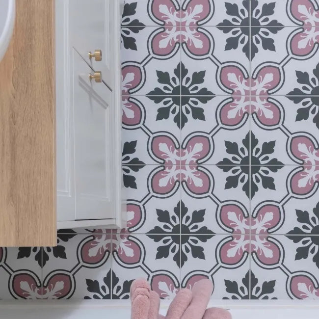
The Moroccan Pink Pattern Tiles it is a compelling choice because it brings character, warmth, and craftsmanship into a space without sacrificing practicality. The intricate pattern creates instant visual interest, turning floors or walls into a design feature while still feeling balanced thanks to the soft pink, grey, and charcoal tones.
The colour combination is what truly sets this tile apart. The pink adds warmth and approachability, while the darker detailing grounds the design, preventing it from feeling overly decorative or busy. This makes it easy to pair with wood cabinetry, white units, stone worktops, and brass or black fittings.
Maintenance and Longevity: A Practical Perspective
One of the biggest misconceptions about pink tiles is that they are difficult to maintain. In reality, they often perform better than white tiles.
Pink hides:
-
Water marks
-
Minor stains
-
Everyday wear
Porcelain and marble pink tiles from Luxury Tiles UK are selected for durability as well as design, making them suitable for both private and commercial use.
Sealing natural stone and using appropriate grout colours will ensure pink tiles age gracefully over time.
Common Mistakes to Avoid with Pink Tiles
The biggest mistake is treating pink as a novelty rather than a material choice.
Avoid:
-
Over-saturating a space with strong pink tones
-
Pairing pink with too many competing colours
-
Using glossy finishes everywhere
-
Ignoring lighting conditions
Pink tiles respond strongly to light. Always consider natural and artificial lighting when selecting shades.
Why Designers Are Choosing Pink Again
Design trends come and go, but pink’s return is rooted in something deeper. As interiors move away from cold minimalism, people crave warmth, softness, and personality.
Pink tiles provide all three.
They don’t dominate a room. They support it. They create spaces that feel lived-in, calm, and human.
For professionals, pink tiles offer creative freedom without compromising commercial viability. For homeowners, they offer beauty that lasts beyond trends.
Final Thoughts: Pink Tiles as a Design Investment
Pink tiles are not a passing trend. They are a response to how people want to feel in their spaces, comfortable, grounded, and quietly inspired.
Whether you are designing a luxury bathroom, renovating a kitchen, or developing a residential project, pink tiles offer a balance of emotion and practicality that few other colours can achieve.
Explore the full pink tile collection at Luxury Tiles UK to see how modern pink can be, soft, elegant, and built to last.
If used thoughtfully, pink tiles don’t just decorate a space.
They change how it feels.


